UX Case Study
FromAtoB
Ticket aggregator platform
Website | iOS App | Android App
Overview
What is fromAtoB? It is a ticket aggregator that provides you with fast connections and best travel deals for all of your journeys. Train, bus and plane: with the fromAtoB App, you can easily book your tickets and manage them on the go on your mobile phone!
The mission is to transform the world of mobility. Everyday commute or an epic adventure, fromAtoB helps you to make smart travel decisions.
- 3 Countries (United States, Canada, and London)
- 1M+ Searches per month
- $19M Revenue
Role & Duration
Sr. Product Designer
Team:
6 Product Designers
4 Product Managers
UX Researcher
Marketing Department
4+ Developers
My Role
As a Product Designer, I was involved in every aspect of the product development process: from brainstorming the next great product innovation to tweaking pixels right before launch.
In more detail, I led two projects:
1. Creation of an original Design System. This system is a core driver to standardize and harmonize product design across a range of platforms.
2. Redesign of the entire product including its web platform, iOS and Android Mobile Applications.
Applied Skills:
Workshop Facilitation, Design Thinking, User Interviews, User Journey Mapping, User Stories, Wireframing, Rapid Prototyping, Usability Testing, Visual Design.
The Problem
1. UX research revealed that young people had a problem using our product: they no longer considered it trendy and beautiful. Colors, fonts and marketing techniques used for 10 years already now looked unfresh compared to the products background of competitors who actively started to rebrand.
2. The business aimed at a full SEO redesign for our brand and platforms moving from serious and sometimes boring styles to more young and catchy ones.
3. Understanding that ‘search’ forms the central part of the user’s journey to finding the best tickets, we needed to rethink and revamp this feature completely.
4. Redesign of the homepage and the search engine prompted redesign of all platform pages.
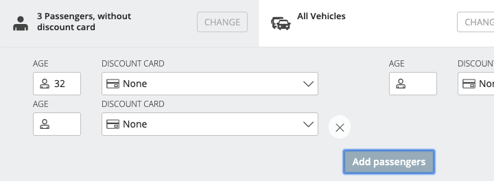
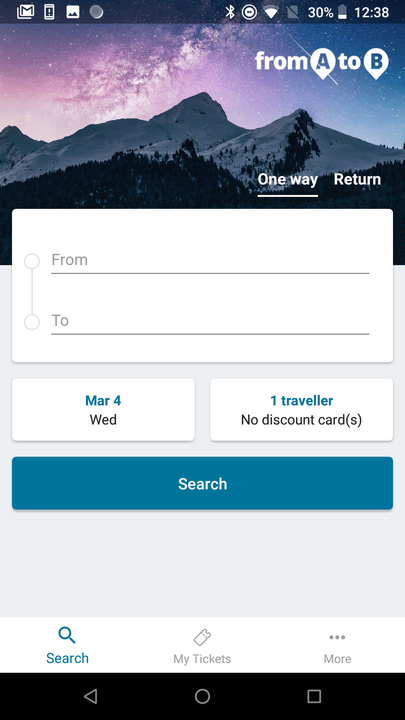
* The old design interface inventory comes below.



Research
Expert Interviews
This project drastically affected different areas of the organization, which at times had conflicting interests. I conducted interviews with representatives from Product, Marketing and Development Leadership to understand each part of the company’s unique requirements and concerns for redesign.
User Interviews
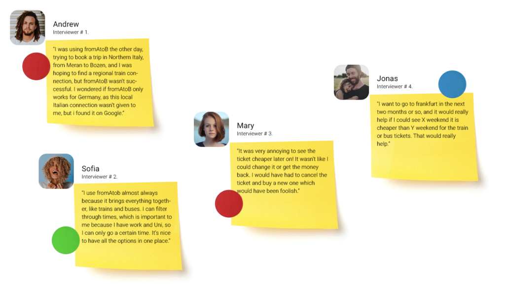
During the entire life of the product, numerous internal and external user interviews were carried out. As a result, there was collected a large user database: their pains, values and goals while using our product.
I gathered a lot of internal feedback, cross-referenced it with user feedback and prioritized design changes.

* Some user comments are given below.
Pain Points
When we researched user needs, it became easier to think about what was really important for them in every detail: including intertwined activities, motivation and problems. Analysis of these patterns made it easier to see where our research had gaps or potential.
The following pain points were identified during user research:

Pain Point 1.
FINANCIAL Pain Points: Finding the destination they can afford that will also allow them to get the experience they need for that trip.
Pain Point 2.
TRUST Pain Points: Lack of confidence that they are getting the best deal to the best destination.
Pain Point 3.
SOCIAL Pain Points: Being a team player and getting everyone to agree on the same destination that also suits them.
Building empathy
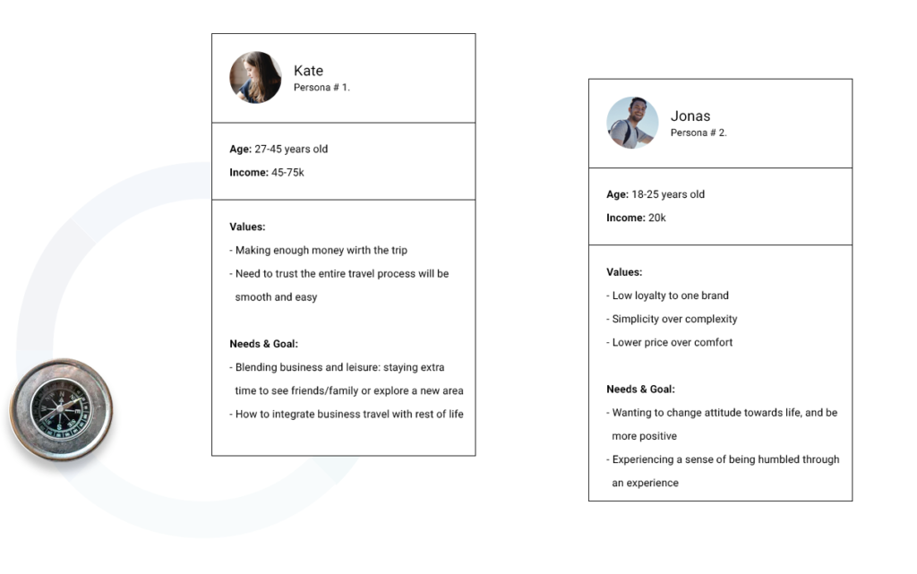
With more than 1000 insights from a 10-week research, our team of 3 organized data, ideas and issues using an affinity mapping technique to discover patterns, to break habits and to see the big picture, which led to customer journey maps, personas and foundation of the design process.
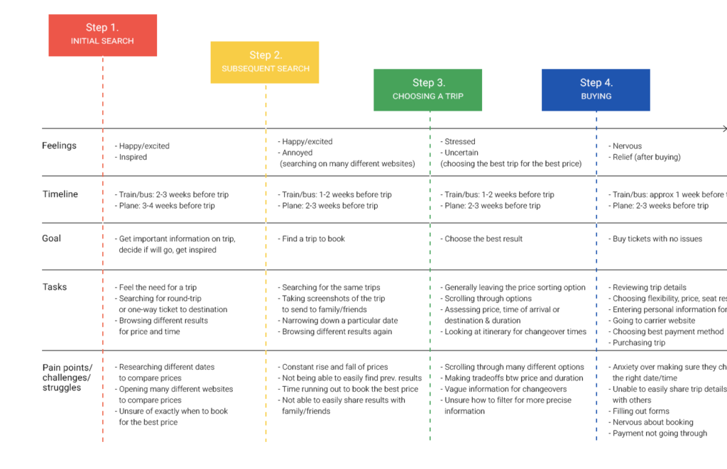
Customer Journey Map
With CJM, we wanted to study all phases of a customer’s journey in our product. We wanted to be able to identify where our product failed to meet expectations or where we even alienated users.
Jobs To Be Done
We wanted to understand our customer needs through Jobs To Be Done framework.
Looking at value creation this way shifts focus from individuals’ psycho-demographic aspects to their goals and motivation. It is not about the user but about usage. Jobs to be done are ultimately about the underlying need and desired outcomes.

Jobs are rarely about the functional aspect alone. They have important emotional aspects too, that consist of personal and social dimensions which can be even more powerful than functional ones. Functional is mostly about cold rational utility or completing a task, which also makes it vulnerable to competition since the customer won’t think twice before switching to another tool which can do the same task faster or cheaper. Emotional, on the other hand, is about feelings, hence hard to quantify, but often irrational. It is about how using a product or service makes you feel and the perception it creates.
That is where advertising and brand positioning often come in.
“People don’t want to buy a quarter-inch drill, they want a quarter-inch hole.”
Rather than focusing on a list of features for a product, the JTBD framework forces us as designers to think about outcomes: will users be able to (happily and easily) complete the job they “hired” the product for? Does this solution provide a better outcome than the existing ones?
Subsequently, we used all the created UX deliverables to evangelize UX research findings and their output for all members of the development team.
Namely, presentation sessions were held with explanation of our findings; huge posters with all the information were printed and hung around the office.


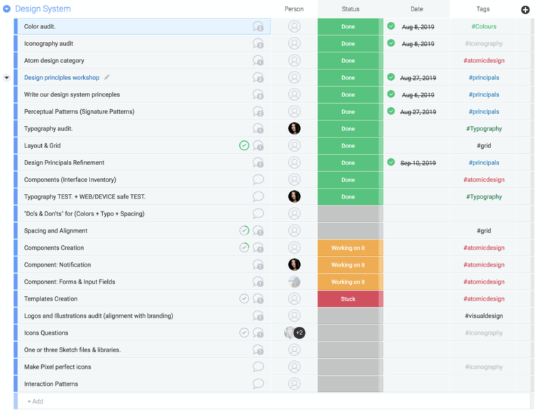
Plan
1. General homepage improvements
Since the project was large enough and it was necessary to understand our resources, together with the Product Owner, we created a plan that took into account the entire redesign process, as well as the source code transfer from the design department to engineers. The engineers were brought in from the very beginning of the project to understand the technical problems and to see how they could be taken into account during redesign.
Ideate
Perceptual Patterns (Signature Patterns)
“Imagine we both have a house with the same set of furniture: a table, a few chairs, a bed and a wardrobe. Even though the furniture is the same, our houses may feel distinctly different: it could be because of the style of the furniture, materials, colors, textures, fabric on the bed covers, style of the ornaments, room layout, lighting, or even the music we play inside.
I refer to such attributes as perceptual patterns. Because of them, your house might feel like a bohemian lair, and mine like a warehouse.”
by Alla Kholmatova in “Design Systems” book.
Examples of perceptual patterns in digital products include tone of voice, typography, color palette, layouts, illustrations and iconography styles, shapes and textures, spacing, imagery, interactions or animations, and all the specific ways in which those elements are combined and used in an interface.
So before proceeding with the actual redesign, I had a workshop with our design team to define Perceptual Patterns.
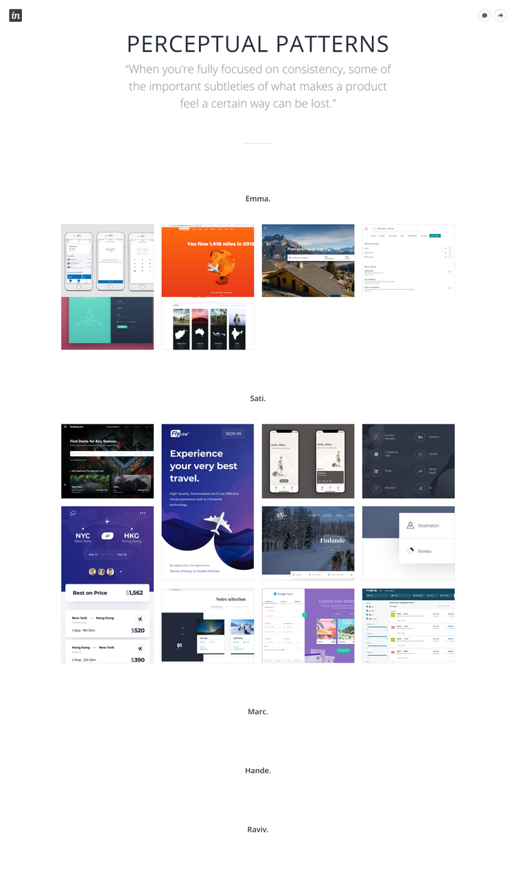
Result:
With the whole team, we formed something like a mood board so that in the process of working on the redesign I would not miss the unique charm of typography, color, or any other visual design elements unique for our company.
Design Improvement Process
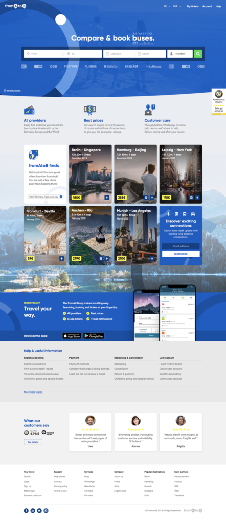
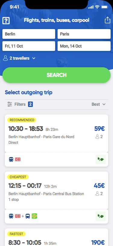
Several generations of concepts with a new design were carried out. In the process of this work, there were considered designs that were both conservative and most similar to the current brand, as well as completely new and provocative.
As a result, several concepts appeared that needed to be validated within the team.
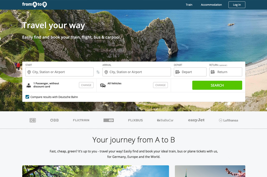
Some experiments with the Desktop Main Page Design you can find below:
Before:
A.
B.

Some experiments with the App Main Page Design you can find below:
Before:

A.

B.
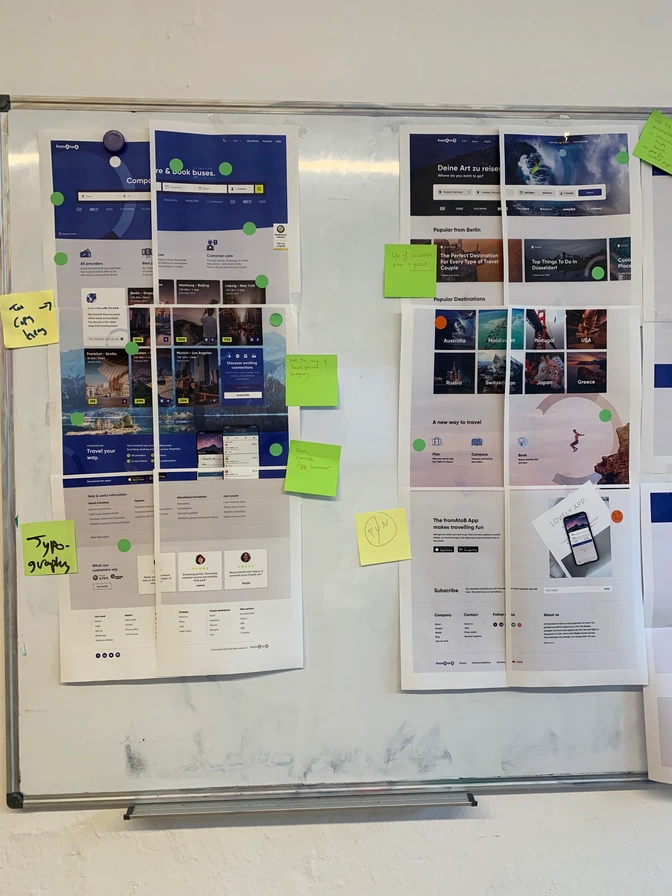
Design Improvement Workshop
Then there was held a workshop with the production team to validate the idea and benchmark successful/unsuccessful solutions.



Key features redesigned
1. General homepage improvements
User problem
The main page contained too much information that was unnecessary for the user. This information had been created to optimize the SEO page on Google.
Business/Tech Challenge
The landing page practically did not retain the user: there were no popular travel destinations profitable for business, which could get promoted and thereby increase the company’s income.
Solution
Having received information from the user research, it was decided to delete all sections unnecessary for the user and add those that would be interesting for both the user and the business.
❌ Sections that were useless to the user were removed.
Before:

After:

✅ User feedback analysis revealed that users were eager to learn about the advantage of using our service in the first screen, and not after the news section, as it was before.
✅ The user was missing the Popular Offers section that our competitors already had.
✅ The hierarchy and visual component of the bottom of the landing page was redesigned.
❌ The image that did not carry any semantic load, never changed nor took up significant space on the screen.
Before:

After:

✅ User feedback analysis revealed that users were eager to learn about the advantage of using our service in the first screen, and not after the news section, as it was before.
✅ The hierarchy and visual component of the bottom of the landing page was redesigned.
2. Search Area
User problem
According to the results of user interviews, it became clear that the search bar was too complicated: users did not understand which were the main and obligatory fields, and which were secondary.
Business/Tech Challenge
Due to the technical solution, the two pages (Search Area on the main and on the result pages) were built on different engines and could not use one search bar.
Solution
Clustering: to help guide the user through the search process, a clear distinction was made between primary input and secondary options. We left only those cells that were primarily needed by users and that they had been using most throughout the life of the product.
Before:

❌ “Compare results with Deutsche Bahn” took the user to Deutsche Bahn website (the provider), which was bad for the business and for users themselves: having come to look for tickets on our website they were automatically ticked off by the checked check-box.
❌ The choice of Number of Passengers and Vehicles was hard to understand, it was not clear that these were optional fields.
After:

✅ The entire search bar was reduced from six to three fields in order to streamline the flow and make it feel less overwhelming.
✅ Trip direction, dates and number of passengers were clustered together above the main search area.
3. Travellers Feature
User problem
It was not obvious to the user that the option for choosing the number of travelers would help to find the best route at the best price more accurately.
The mechanics for changing the number of travelers was complicated and inconsistent.
Business/Tech Challenge
Technically, there were several different widgets on different pages (platforms) to solve the same problem. The number of dissatisfied users increased.
Solution
The dropdown layout was changed to a standard one as we moved towards design systematization. A research on competitors and users was carried out. Then we compared insights from the technical side and the business. After all the information was analyzed, the following results were obtained:
Before:


After:

✅ The final version for Travellers became a prop for the next stage of the product: a feature enabling to save the history of my Travellers.
✅ The user no longer needed to fill in the age for each traveller since only information on the user’s age group was sufficient for the searching algorithm: an adult, a youth, or a child.
✅ The input field became visually larger and easier to click. It was decided to use standard browser and system dropdowns to select travel discount cards, to optimize the SEO of the website and improve conversion as well as to simplify development.
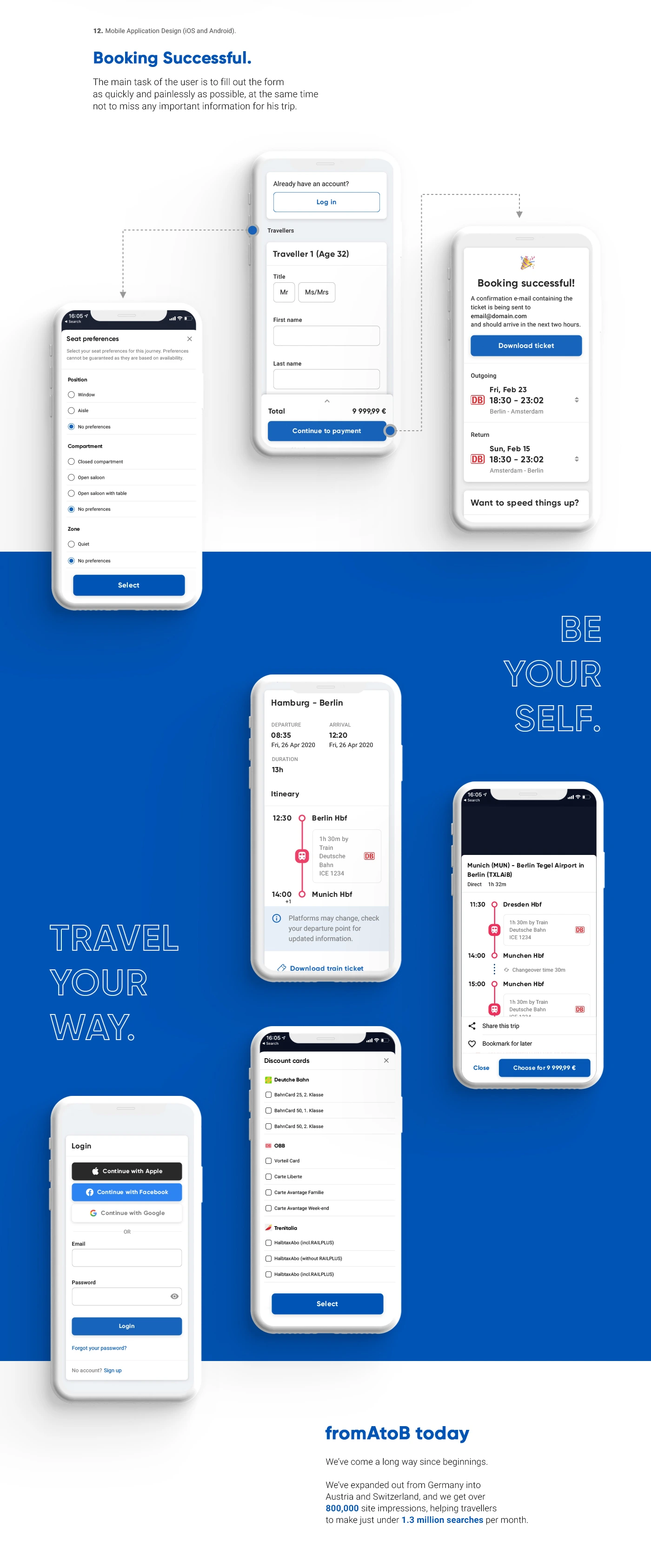
4. Other pages and features
Tremendous work was carried out to change all pages on all platforms, which the whole company was involved in. All squads stopped their work in order to single-handedly complete the UX redesign and improvement for the entire product.

Lessons Learned
1. Redesign + UX + Design System = 🤯
Redesigning, improving user experience and creating a design system from scratch at the same time was very difficult. Had I had more time, I would first have made a design system based on the old design, and after it had been implemented, I would have thought about redesign and UX improvement.
2. Management is an art
At first I tried to make the design process more democratic, but after a few iterations it became clear that project teams definitely needed a single control center: otherwise, it all would have resulted in chaos.
3. Product Design Innovations Reduce Costs and Increase Company Value
2019-2020 was a tough year due to redesign and design system creation.
Summing up: The company doubled the money it spent on hiring employees for the redesign project. It reduced the cost for product manufacturing. In addition, the company’s value increased, which was later useful for its cost negotiation.