Overview
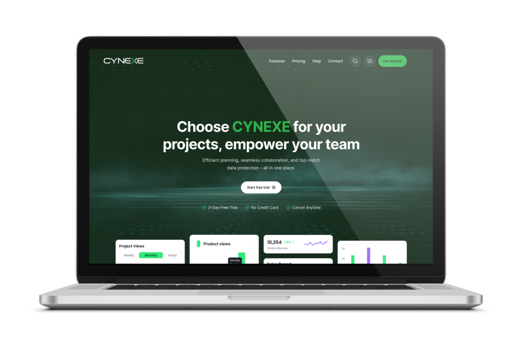
What is Cynexe? It is a comprehensive management platform that provides you with the best solutions for handling enterprise projects and inventory. From project planning to inventory tracking, with the Cynexe App, you can efficiently manage everything on the go.
The mission is to transform the world of enterprise management. Whether it’s everyday operations or implementing large-scale projects, Cynexe helps you make smart decisions to optimize the management of your resources and assets.
- 3 Countries (United States, Canada, and London)
- 2K+ Users per month
- $2M Revenue
Role & Duration
Front End Developer UX / UI Designer.
Team:
4 Product Designers
3 Product Managers
UX Researcher
Marketing Department
10+ Developers
My Role
As a UX / UI Designer, I was involved in every aspect of the product development process: from brainstorming the next great product innovation to tweaking pixels right before launch.
In more detail, I led two projects:
1. Creation of an original Design System. This system is the core driver to standardize and harmonize the product design across a range of platforms.
2. Redesign of the entire product including its web platform.
Applied Skills:
Workshop Facilitation, Design Thinking, User Interviews, User Journey Mapping, User Stories, Wireframing, Rapid Prototyping, Usability Testing, Visual Design.
The Problem
1. UX research revealed that young people had a problem using our product: they no longer considered it trendy and beautiful. Colors, fonts and marketing techniques used for 10 years already now looked unfresh compared to the products background of competitors who actively started to rebrand.
2. The business aimed at a full SEO redesign for our brand and platforms moving from serious and sometimes boring styles to more young and catchy ones.
3. Understanding that ‘search’ forms the central part of the user’s journey to finding the best tickets, we needed to rethink and revamp this feature completely.
4. Redesign of the homepage and the search engine prompted redesign of all platform pages.
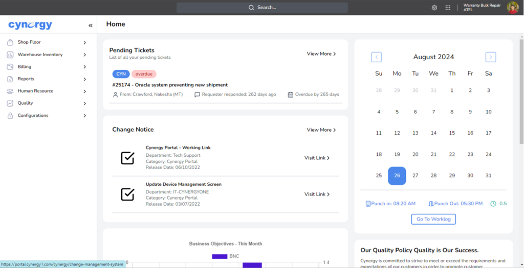
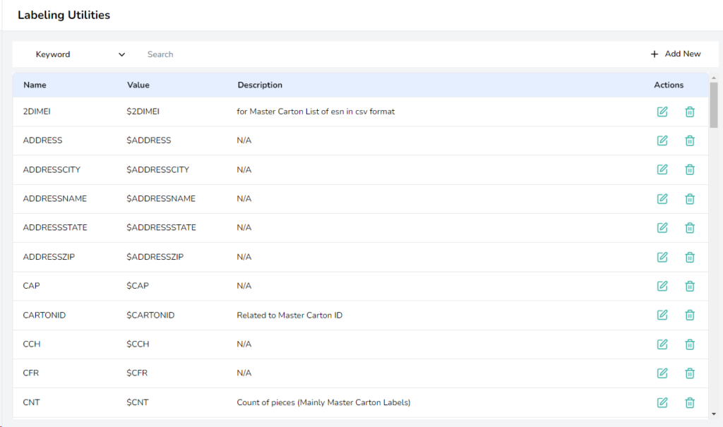
* The old design interface inventory comes below.

Research
Expert Interviews
This project drastically affected different areas of the organization, which at times had conflicting interests. I conducted interviews with representatives from Product, Marketing and Development Leadership to understand each part of the company’s unique requirements and concerns for redesign.
User Interviews
During the entire life of the product, numerous internal and external user interviews were carried out. As a result, there was collected a large user database: their pains, values and goals while using our product.
Jobs To Be Done
We wanted to understand our customer needs through Jobs To Be Done framework.
Looking at value creation this way shifts focus from individuals’ psycho-demographic aspects to their goals and motivation. It is not about the user but about usage. Jobs to be done are ultimately about the underlying need and desired outcomes.
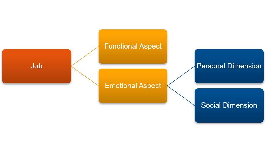
Jobs are rarely about the functional aspect alone. They have important emotional aspects too, that consist of personal and social dimensions which can be even more powerful than functional ones. Functional is mostly about cold rational utility or completing a task, which also makes it vulnerable to competition since the customer won’t think twice before switching to another tool which can do the same task faster or cheaper. Emotional, on the other hand, is about feelings, hence hard to quantify, but often irrational. It is about how using a product or service makes you feel and the perception it creates.
That is where advertising and brand positioning often come in.
Rather than focusing on a list of features for a product, the JTBD framework forces us as designers to think about outcomes: will users be able to (happily and easily) complete the job they “hired” the product for? Does this solution provide a better outcome than the existing ones?
Plan
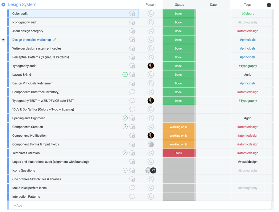
Project Plan Roadmap
Since the project was large enough and it was necessary to understand our resources, together with the Product Owner, we created a plan that took into account the entire redesign process, as well as the source code transfer from the design department to engineers. The engineers were brought in from the very beginning of the project to understand the technical problems and to see how they could be taken into account during redesign.
Ideate
Perceptual Patterns
Examples of perceptual patterns in digital products include tone of voice, typography, color palette, layouts, illustrations and iconography styles, shapes and textures, spacing, imagery, interactions or animations, and all the specific ways in which those elements are combined and used in an interface.
So before proceeding with the actual redesign, I had a workshop with our design team to define Perceptual Patterns.
Result
With the whole team, we formed something like a mood board so that in the process of working on the redesign I would not miss the unique charm of typography, color, or any other visual design elements unique for our company.
Key features redesigned
Several generations of concepts with a new design were carried out. In the process of this work, there were considered designs that were both conservative and most similar to the current brand, as well as completely new and provocative.
As a result, several concepts appeared that needed to be validated within the team.
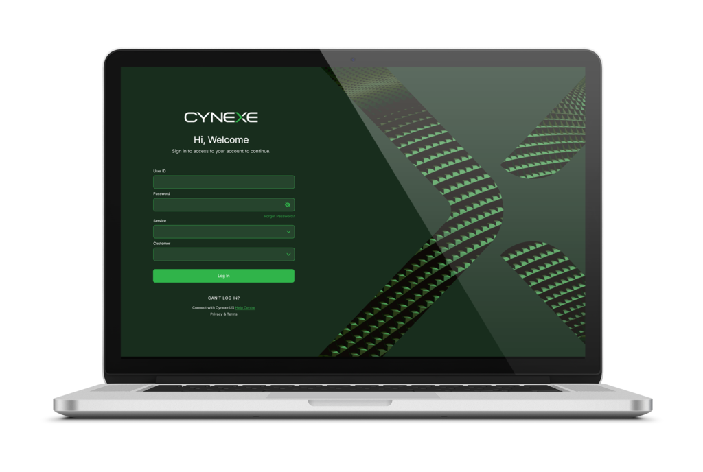
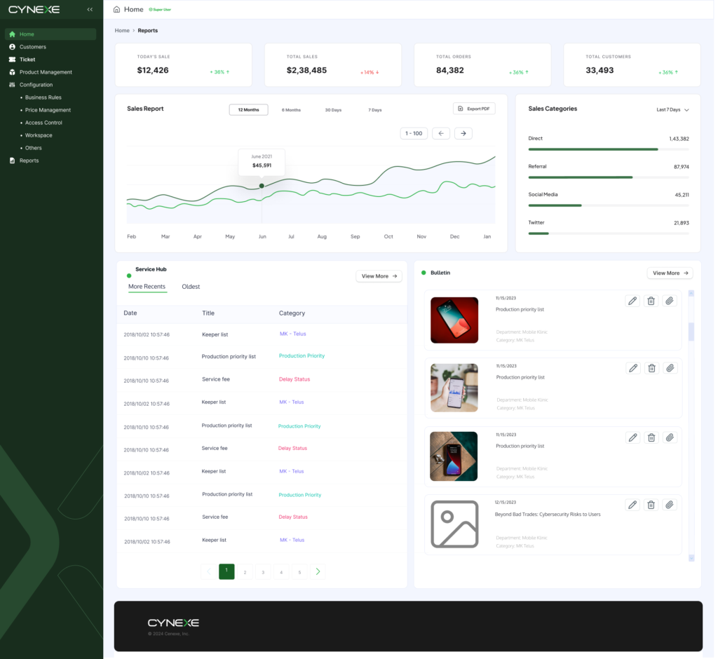
Some experiments with the Desktop Main Page Design you can find below.
1. General homepage improvements
Having received information from the user research, it was decided to delete all sections unnecessary for the user and add those that would be interesting for both the user and the business.
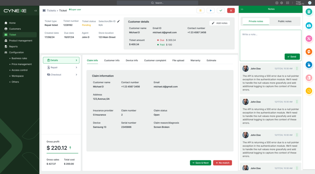
3. Service Hub Module
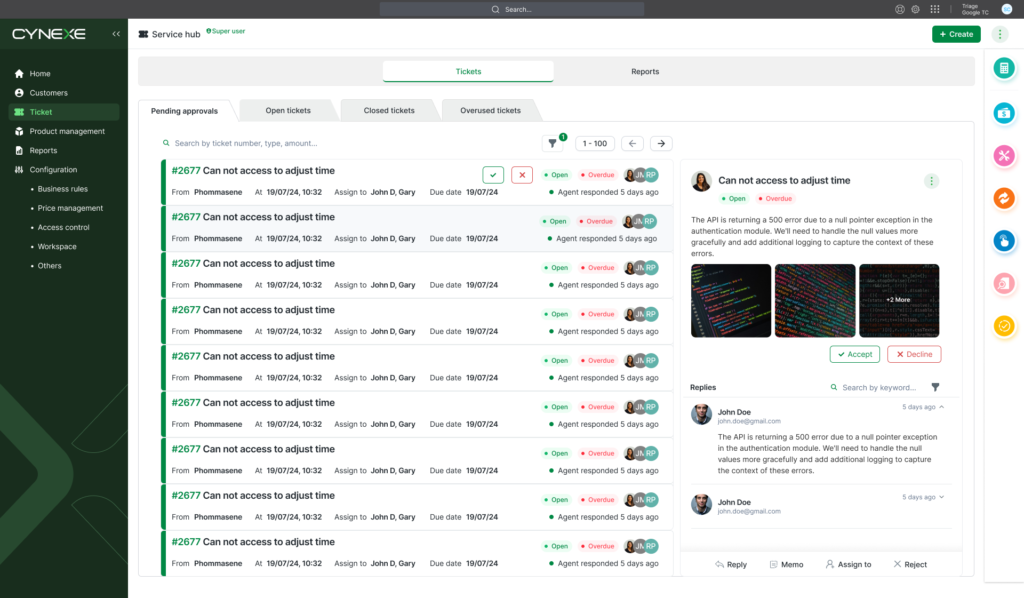
Help Desk Efficiency and Productivity
A well-designed user interface enables support agents to quickly find the information they need, respond to user requests, and resolve issues efficiently. Less time wasted navigating a complicated interface means more time spent helping customers.
Customer Satisfaction
Customers value speed and efficiency in resolving their issues. A well-designed user interface enables support agents to provide faster and more effective service, which translates into higher customer satisfaction. When users feel that their issues are resolved quickly and efficiently, they are more likely to have a positive experience with the company.
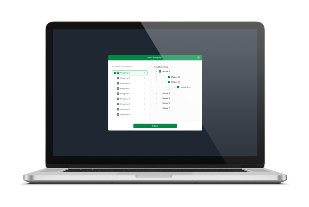
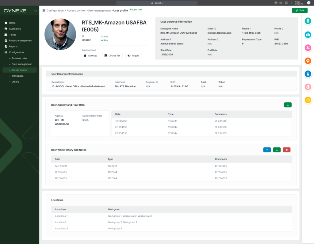
4.User Management Module
Security: A proper design can improve security by highlighting critical options and warnings, such as confirmations before deleting a user or changing permissions. It can also include visible and accessible authentication and authorization mechanisms, ensuring that only authorized users perform certain actions.
Scalability and maintenance: A good interface design not only takes into account current needs, but also how the module might evolve in the future. An organized structure makes it easy to add new functionality without compromising clarity or usability. This also makes system maintenance and upgrades easier.
5.Labeling Module
We completely redesigned the structure of the labeling module, which, despite being a complex application, we were able to turn around and transform it, giving it an updated and more user-friendly interface.


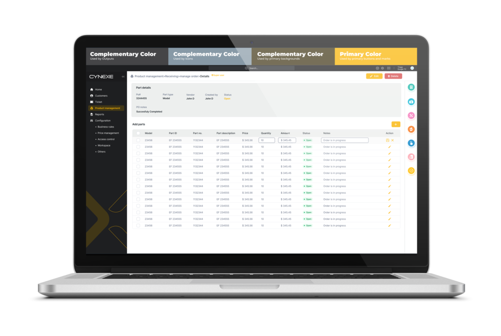
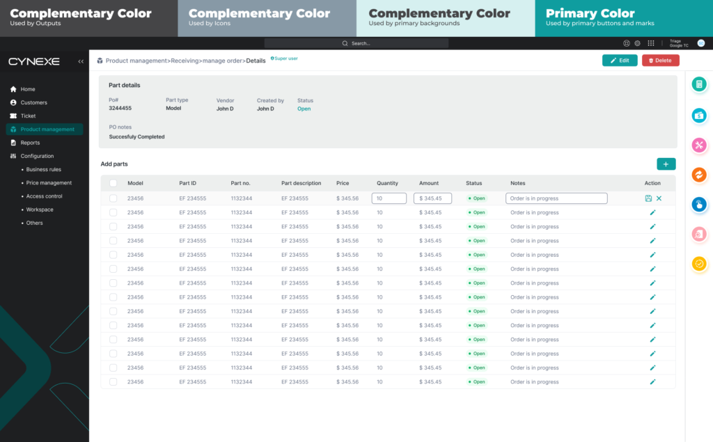
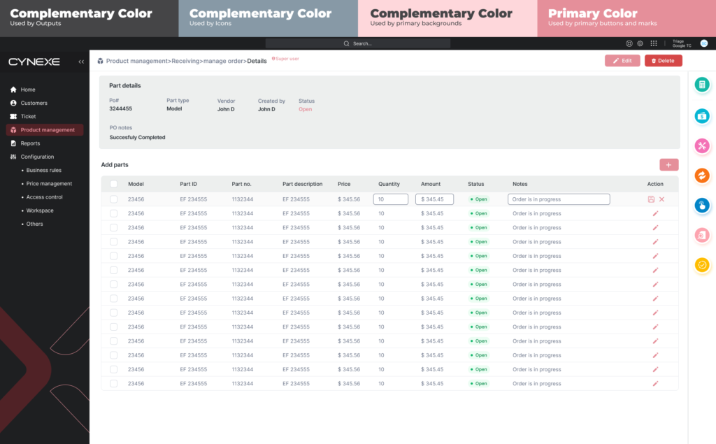
6.Light Mode
Changing the color theme in a desktop application is an important feature for several key reasons:
Customization and user preference: Users have different tastes and preferences when it comes to the look and feel of an application. Allowing them to change the color theme gives them the ability to customize their experience, making the application feel more personal and comfortable to use.
Accessibility: Different color themes can help meet the accessibility needs of users with visual impairments. For example, people with color blindness or sensitivity to certain colors can benefit from customized themes that improve visibility and understanding of content.
Improving concentration and focus: Different colors and themes can influence users’ mood and productivity. Some colors may be more relaxing, while others may be more stimulating. Allowing them to change the theme can help users adjust their work environment to be more conducive to concentration and productivity.
7.Dark Mode
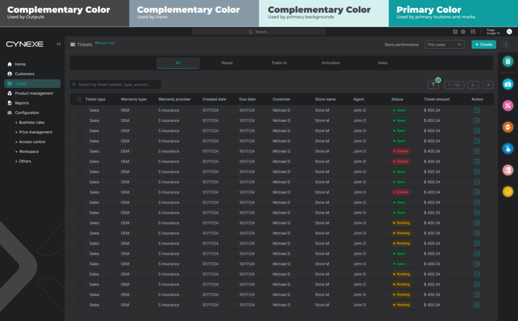
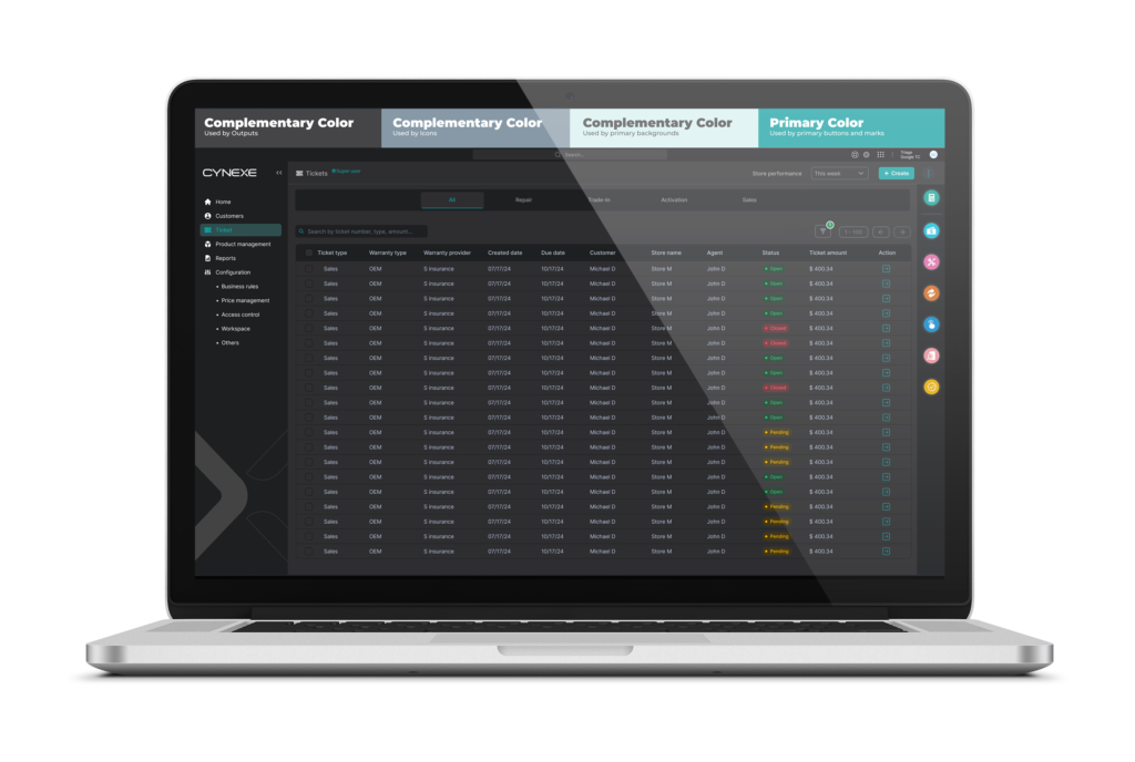
We have completely transformed each of the portal modules to make it compatible with Dark Mode. Offering the option of a dark mode allows users to customize their application experience according to their personal preferences and needs, which improves satisfaction and overall usability.
Lessons Learned
1. Redesign + UX + Design System = 🤯
Redesigning, improving user experience and creating a design system from scratch at the same time was very difficult. Had I had more time, I would first have made a design system based on the old design, and after it had been implemented, I would have thought about redesign and UX improvement.
2. Management is an art
At first I tried to make the design process more democratic, but after a few iterations it became clear that project teams definitely needed a single control center: otherwise, it all would have resulted in chaos.
3. Product Design Innovations Reduce Costs and Increase Company Value
2023-2024 was a tough year due to redesign and design system creation.
Summing up: The company doubled the money it spent on hiring employees for the redesign project. It reduced the cost for product manufacturing. In addition, the company’s value increased, which was later useful for its cost negotiation.
